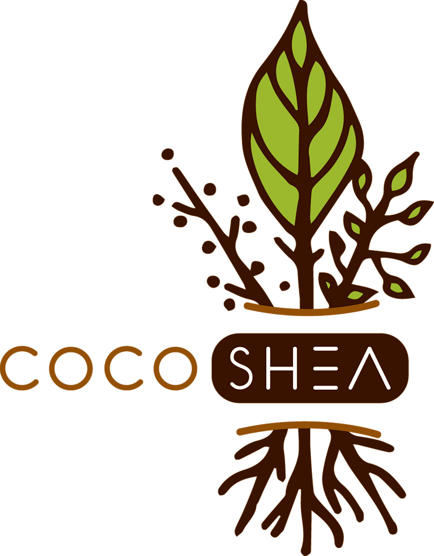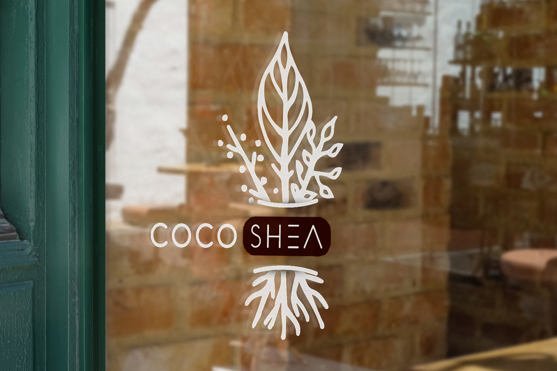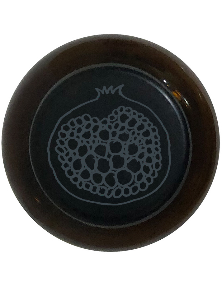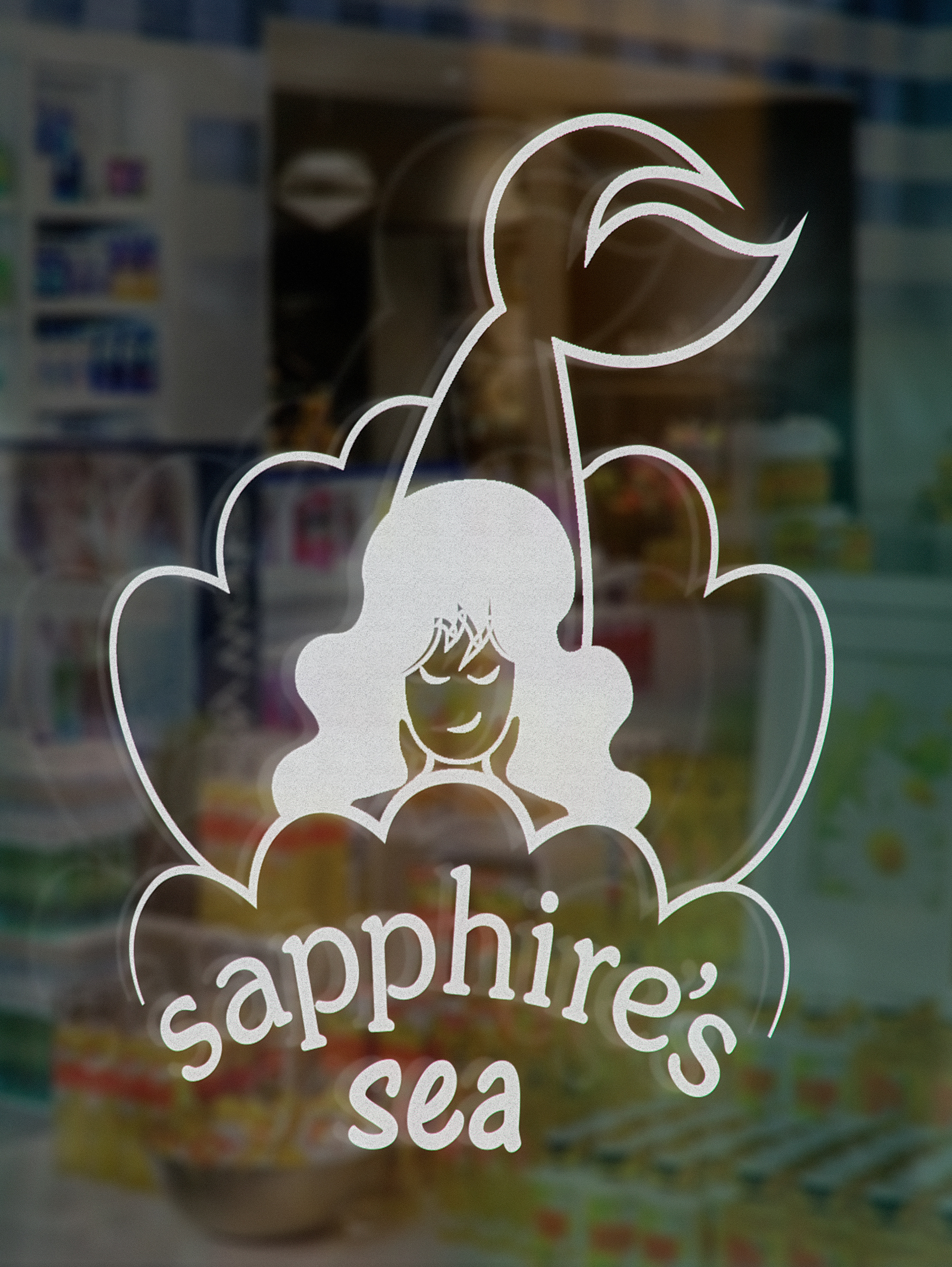
I created packaging for a fairly new, Kansas City local, body care company- though the original project was only to create packaging ( a carrier), I decided to change the colors, logo mark and use my new typeface for the slogan which contrasts their old-type, serif font. Given the word natural is in title and shea is a common ingredient of theirs, I thought is was ideal to add a couple shades of brown. Their original logo rotated colors from black, a blush baby-pink and a deep forest green; choosing the latter to follow the legacy, I went with a more vibrant green relating to the autumn scale (which many of their products fall under those seasonal colors).
Though their design has updated since then, here is their current website. Also if you scroll down to their first 12 pictures on instagram, you can see their original logo on the products.
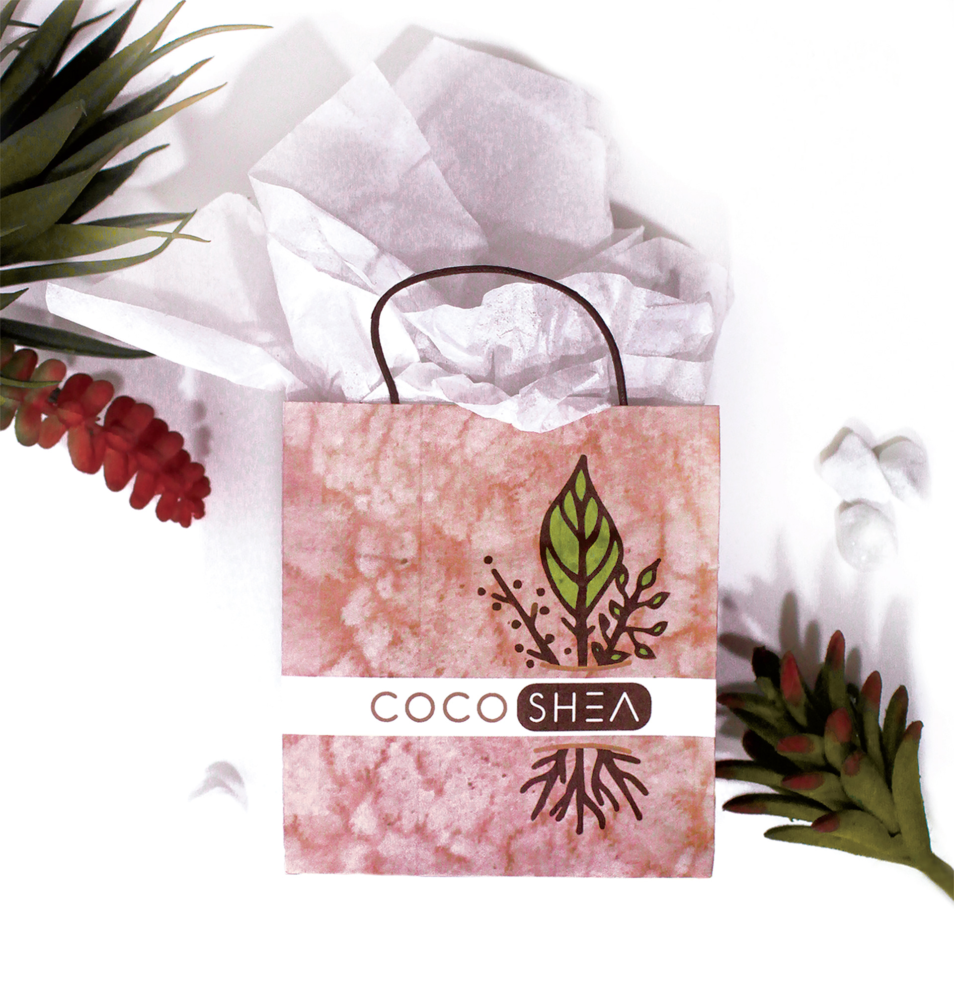
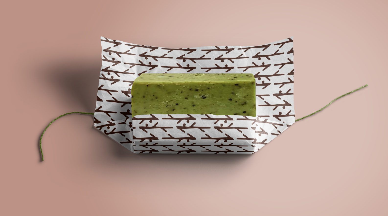
Below are my illustrations and mockups.