ALTRU is a clothing company that will raise awareness and donate to community issues.
We will promote support and donate to organizations that are helping a cause by selling clothes that have the art contest winner’s art on the product with the design being based on the organization’s cause. The organizations that we will be donating to will change periodically.
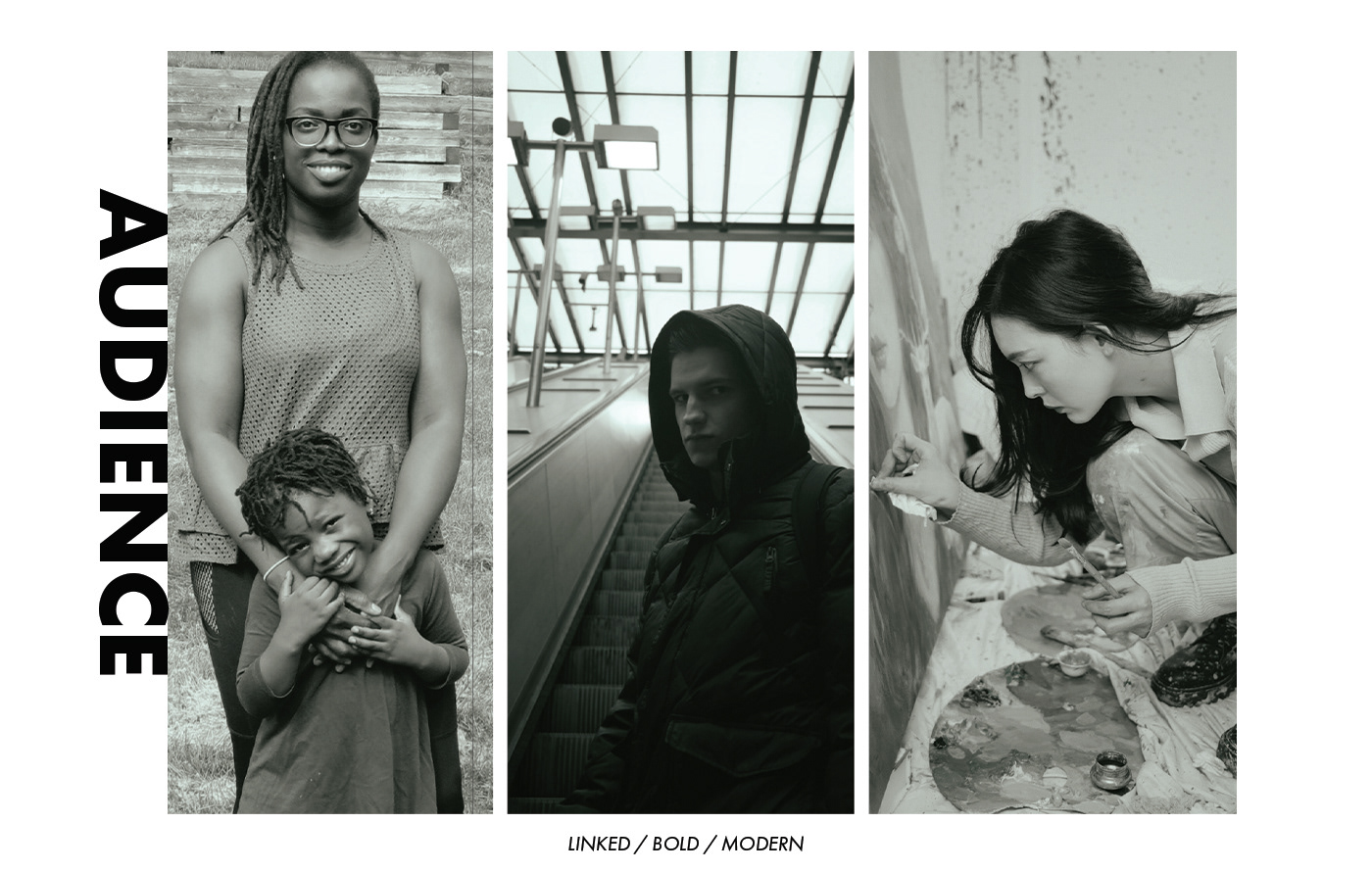
The Givers, Opportunist and Artists
A giver is a person who is actively selfless. Spends their time doing charity work. Constantly finds a way to talk about the issues going on in the world. They search for deeper meanings in a situation and try to view both sides of the story to find a solution.
The Opportunist is actively looking for attention but doesn’t want to seem that way, so they cover by being an occasional activist. Spend their time hanging with friends and going out into the city life but sprinkle in a few activities that have to do with changing the world so they seem knowledgeable about problems going on. They would say “Oh, yeah- I heard about that! I actually went to that protest!” Acting like they played a part in helping when really all they did was take a video for their social media then leave.
The Artist: A person who uses art to interpret how the view things. Spends their free time hanging with friends, making art, or looking at important messages on social media. They don’t like to cause discomfort, but are knowledgeable and want to learn about what goes on in the world. They act carefree, but get inspiration from their hope of a better day.

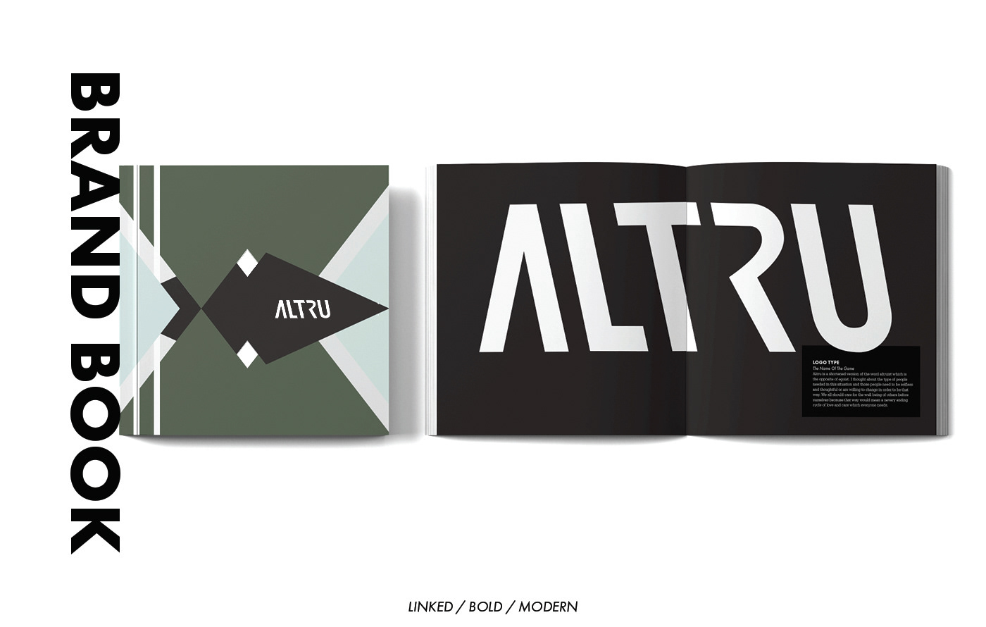
The type families are Futura PT and Serifa. I used Serifa for the body and went with Futura for the bolder parts of the text. Those match my modern and bold attributes very well. I further instigated the attribute link through the assets and the word mark. Using the absence of closure help further the design by bringing in a void that people will want to connect. As this is a continued venture of my theme ' edge', just about everything has an angle to it and I feel like that also helps bring out the logo.
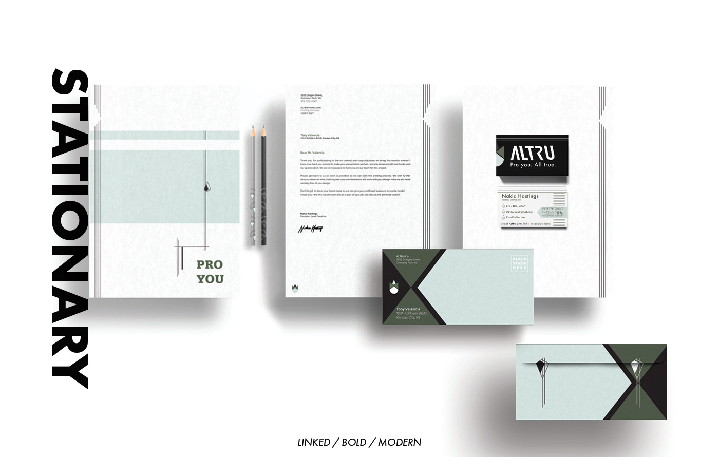
The stationary would be used between us and the organizations we are helping / contestant winners / shipping details. Given this is something more about information, I used less color and patterns- apart from the envelop, of course. The envelop will be the first visual when coming in contact and the design will bring curiosity.


This is an example of clothing that would be sold at the store. The colors are representative of the organization as well as holding a deeper meaning in symbolism to asian communities along with the cherry blossom tree and the pig.
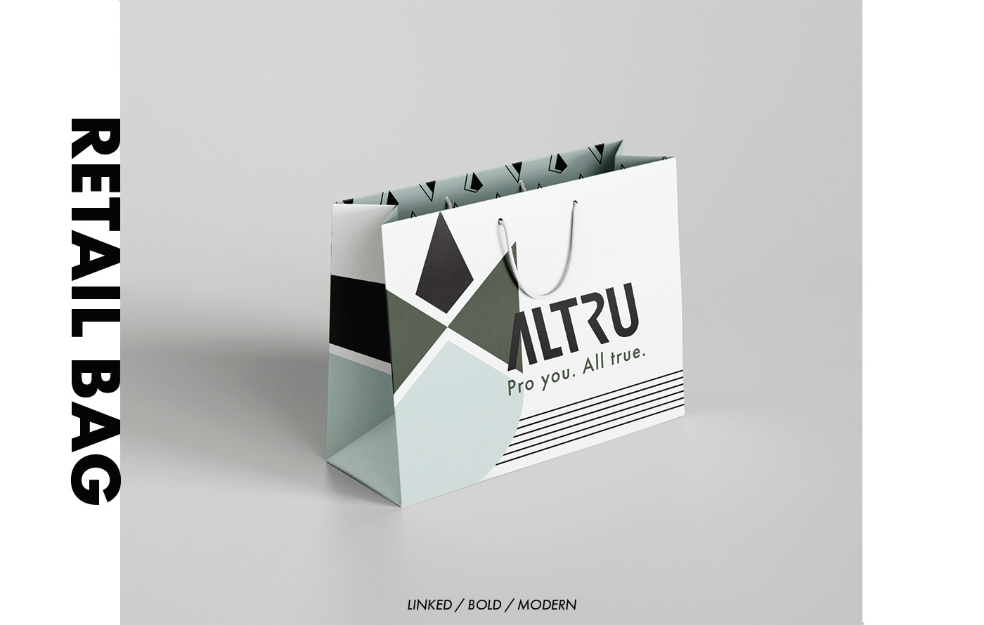
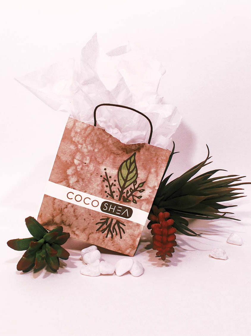
From the physical store, this would be the bag that would be carried. Realistically it would cost too much and depreciate the brand if we were to also change the bags when the new clothing line comes in. This way we also have a little separation and have something to be recognized by in the public eye.

A bus sign is appropriate as it is up close and personal which is exactly what ALTRU needs. With it's bold feature, it will draw the eye and more so than a billboard, the public walking around or waiting will have time to read the information and check out the information on our website or social media.